Overview
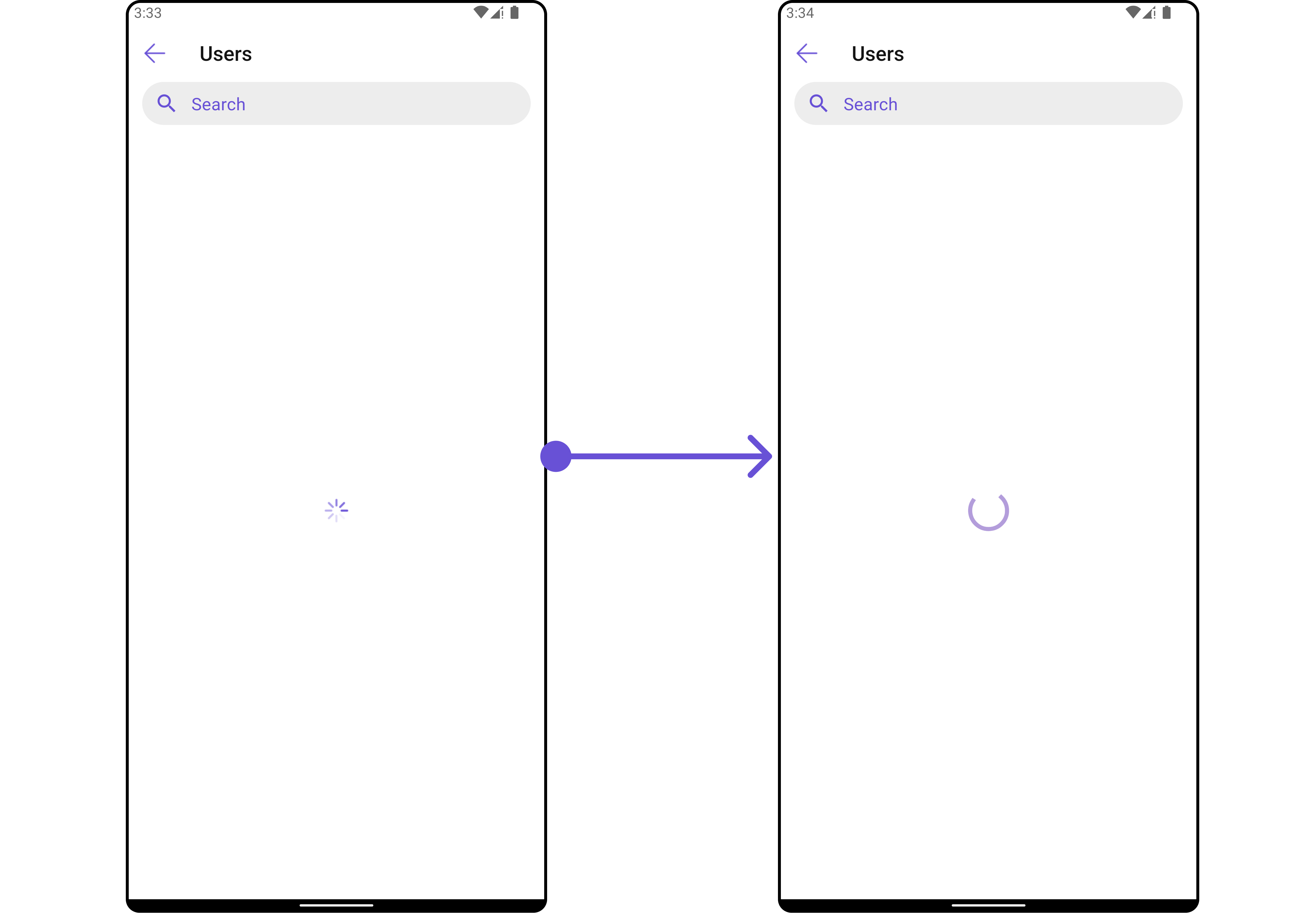
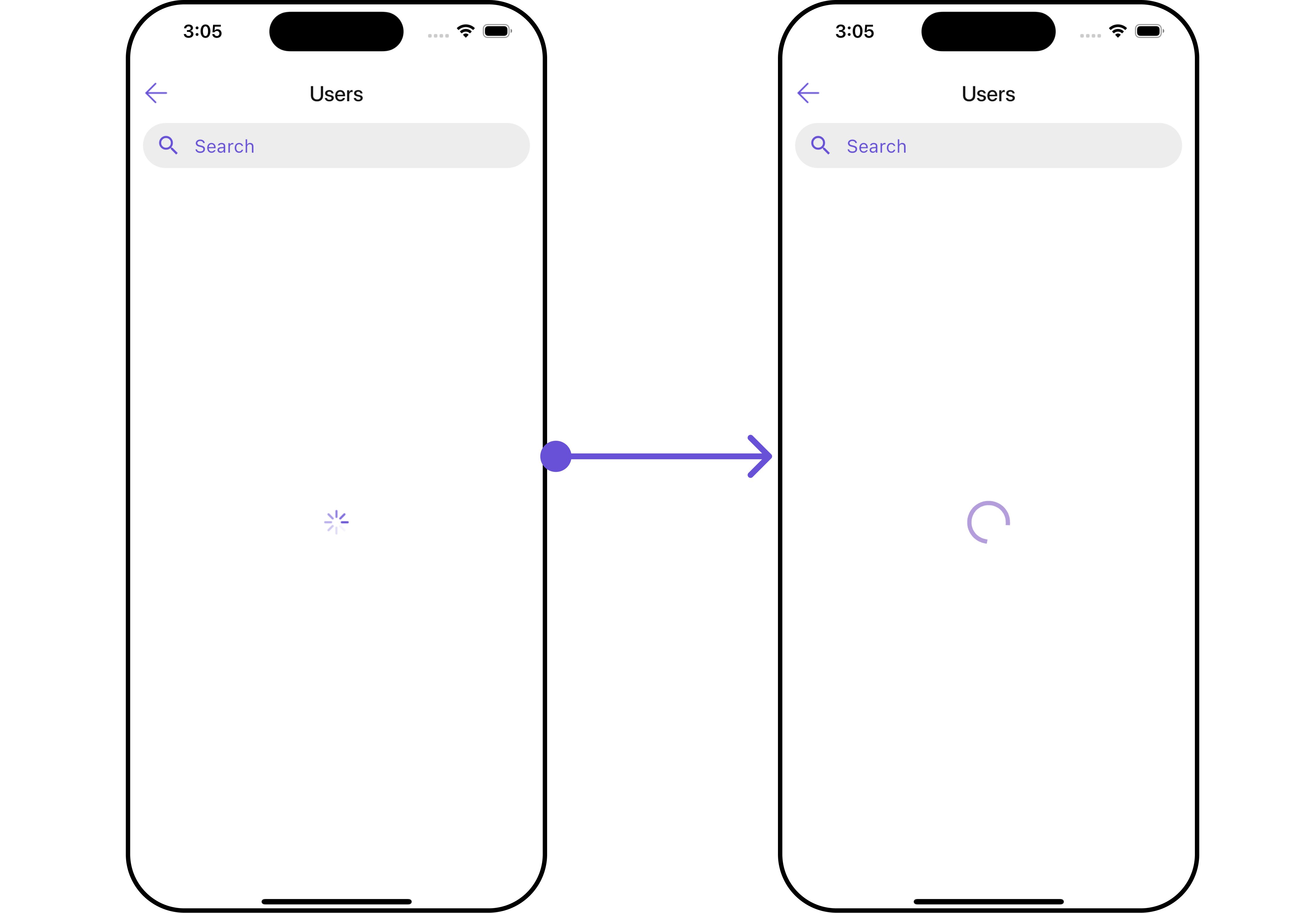
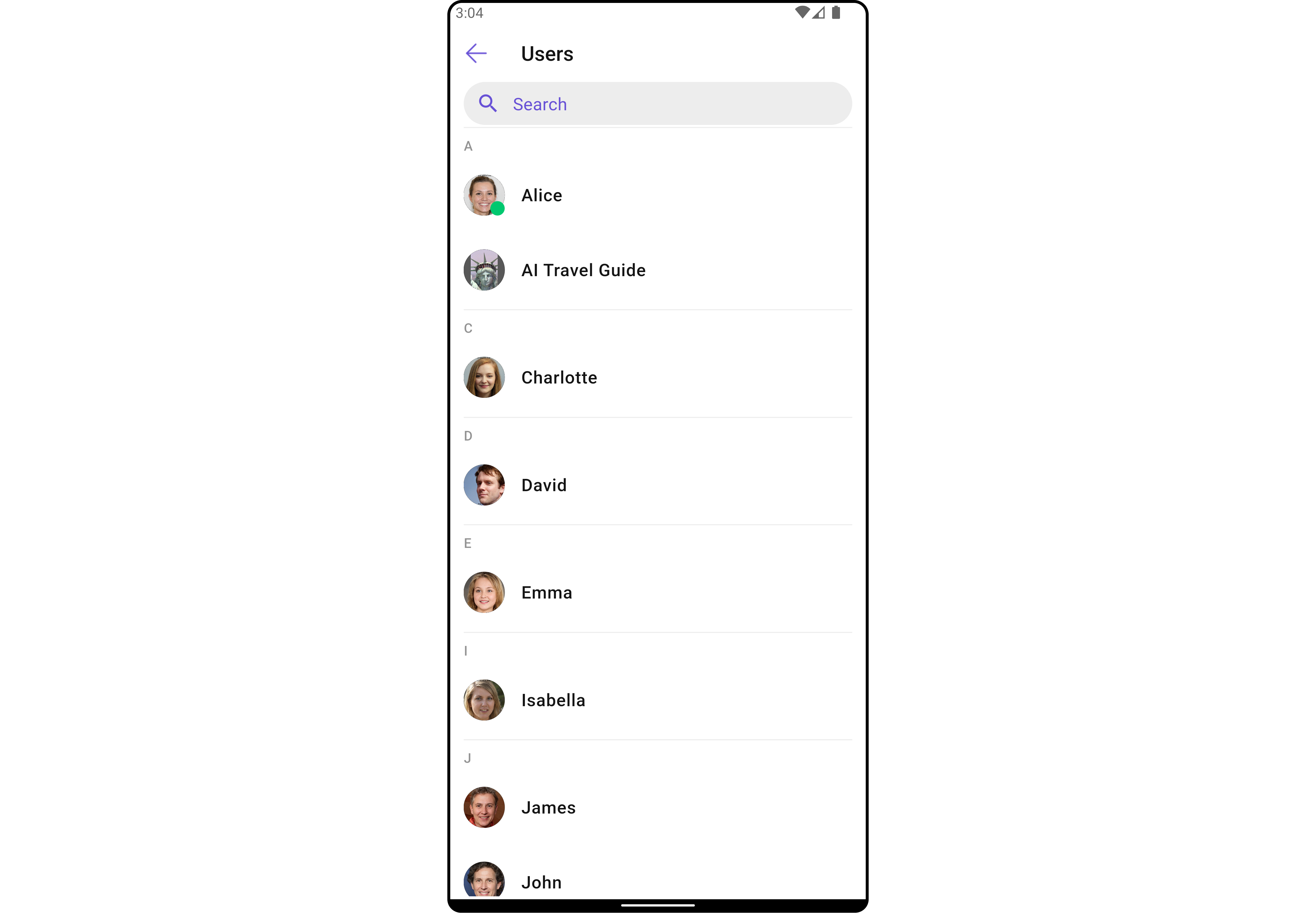
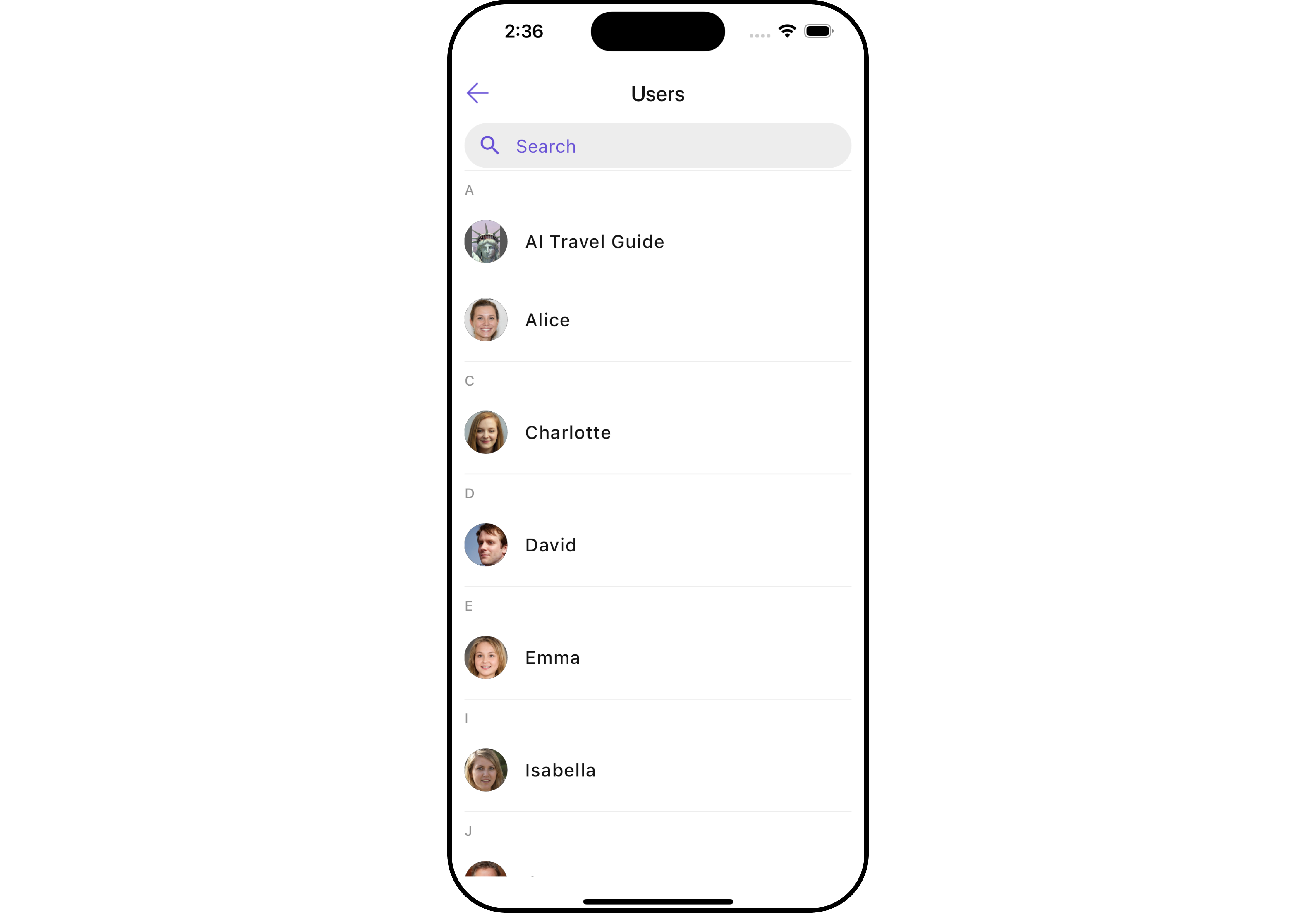
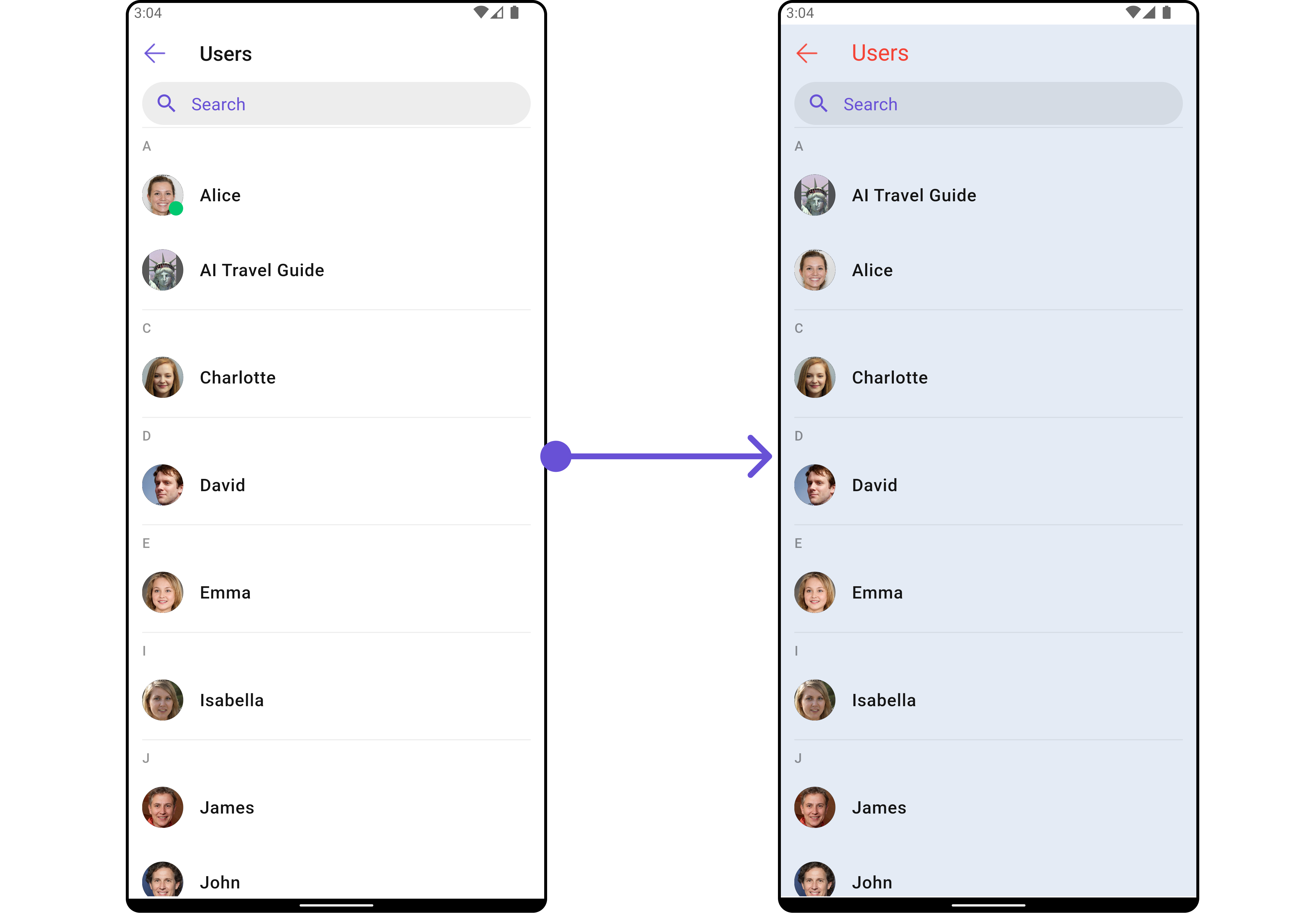
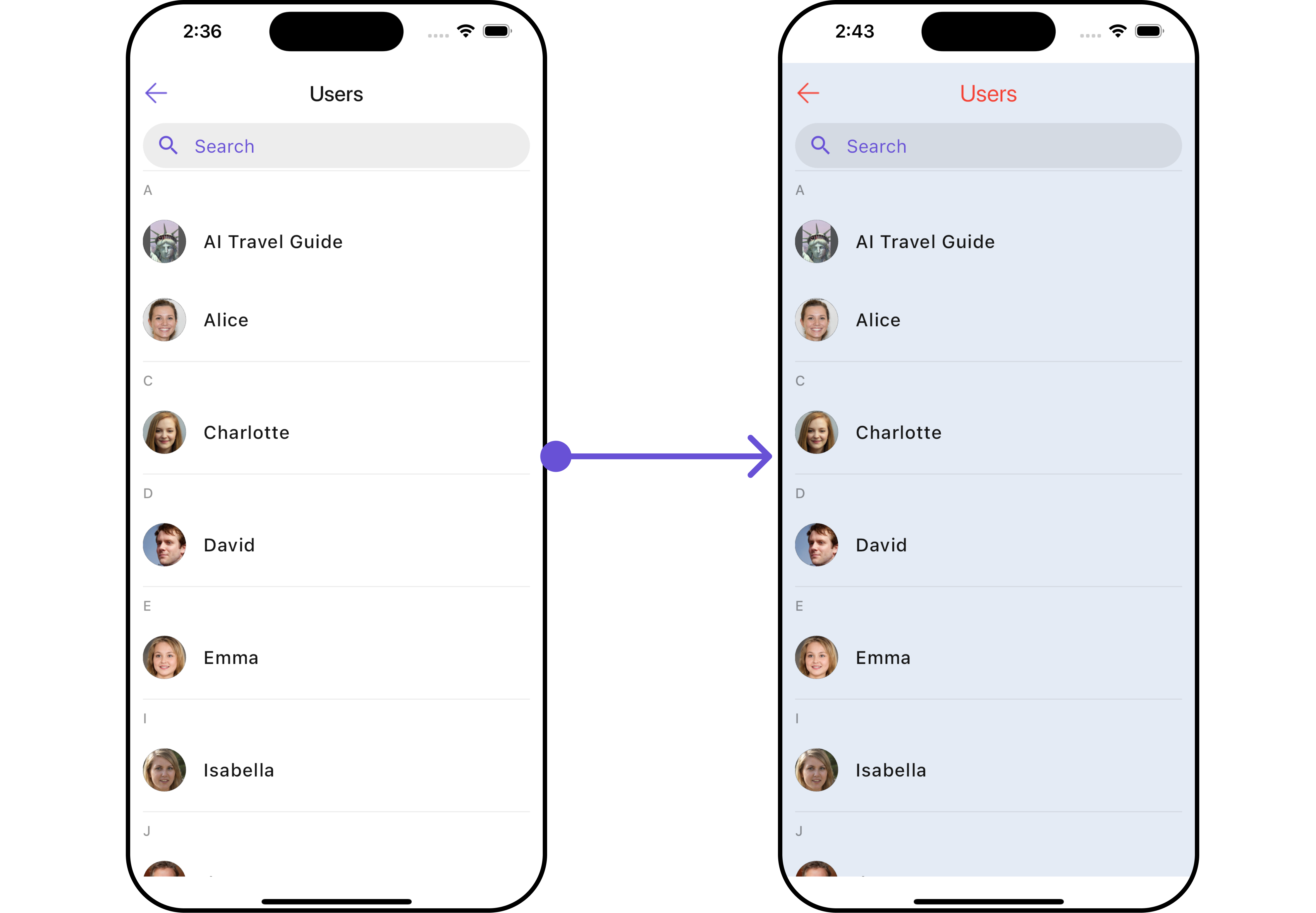
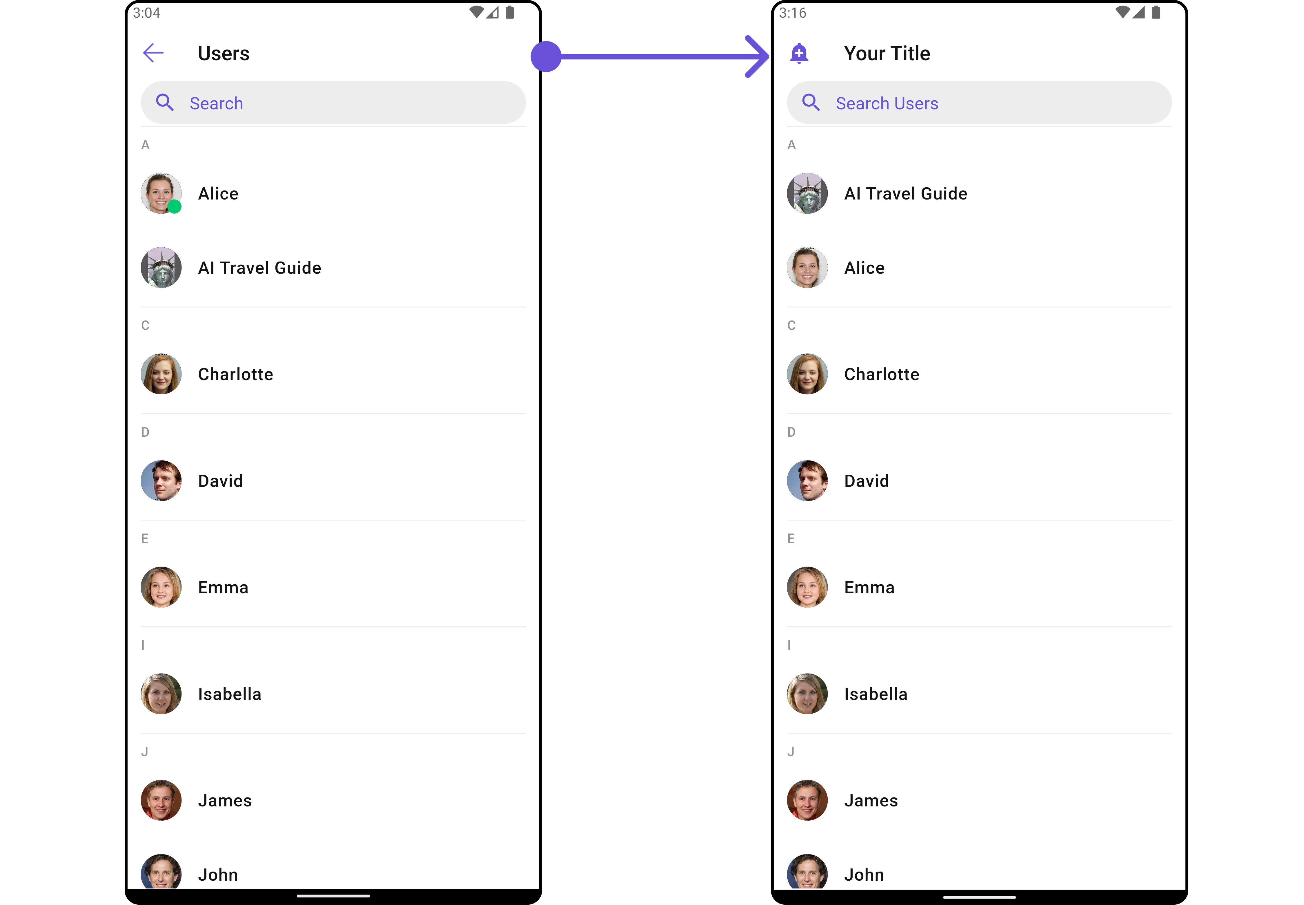
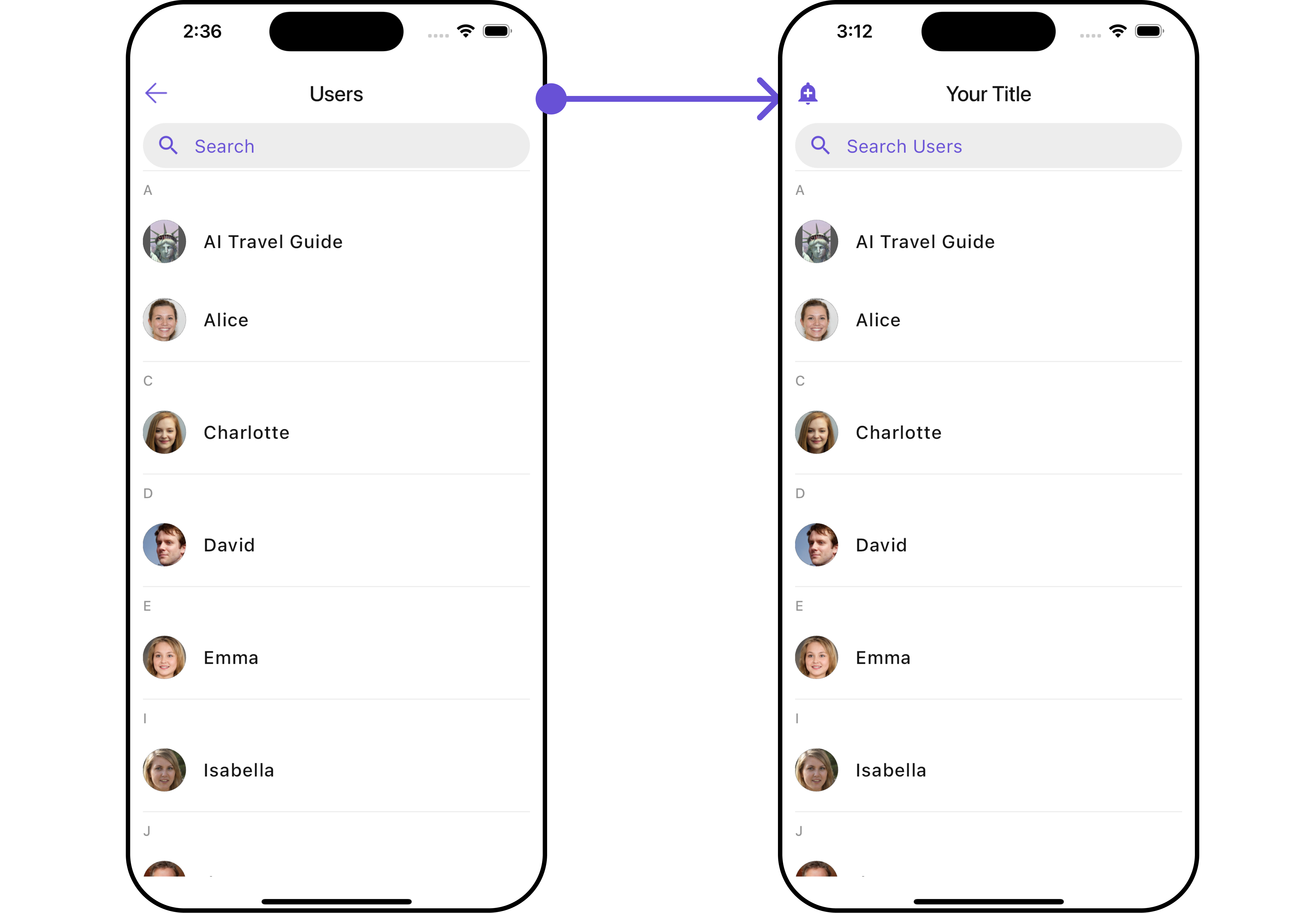
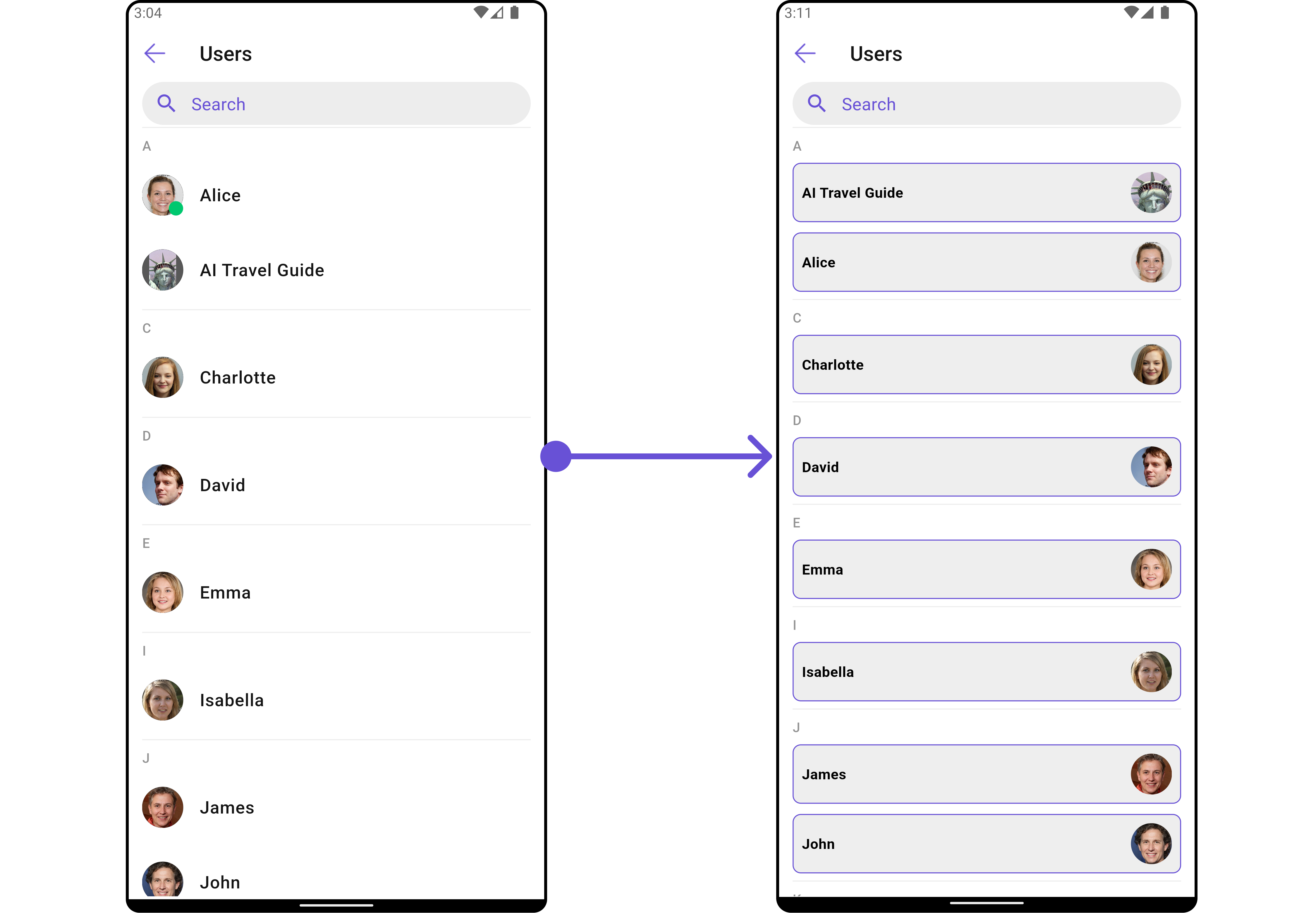
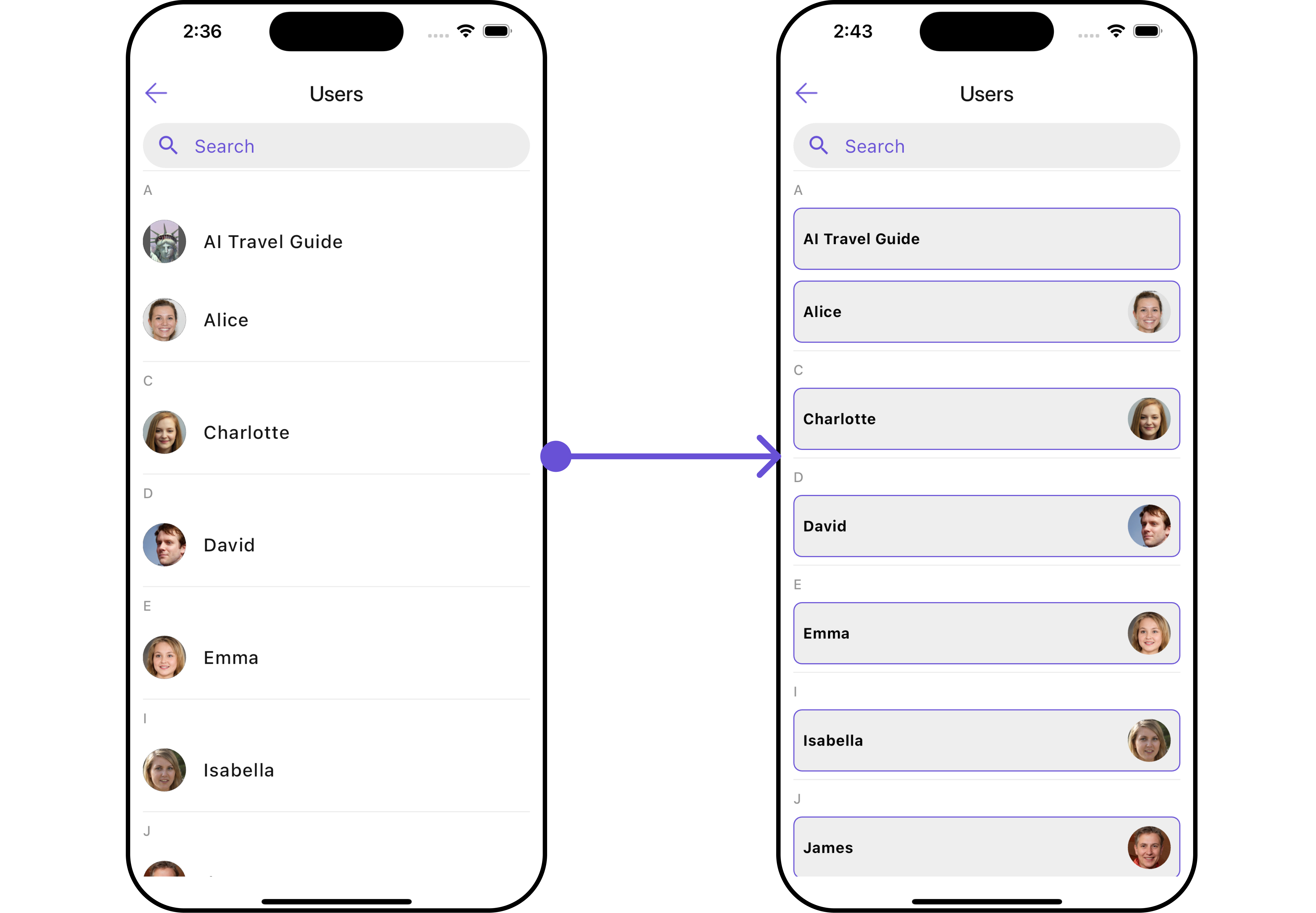
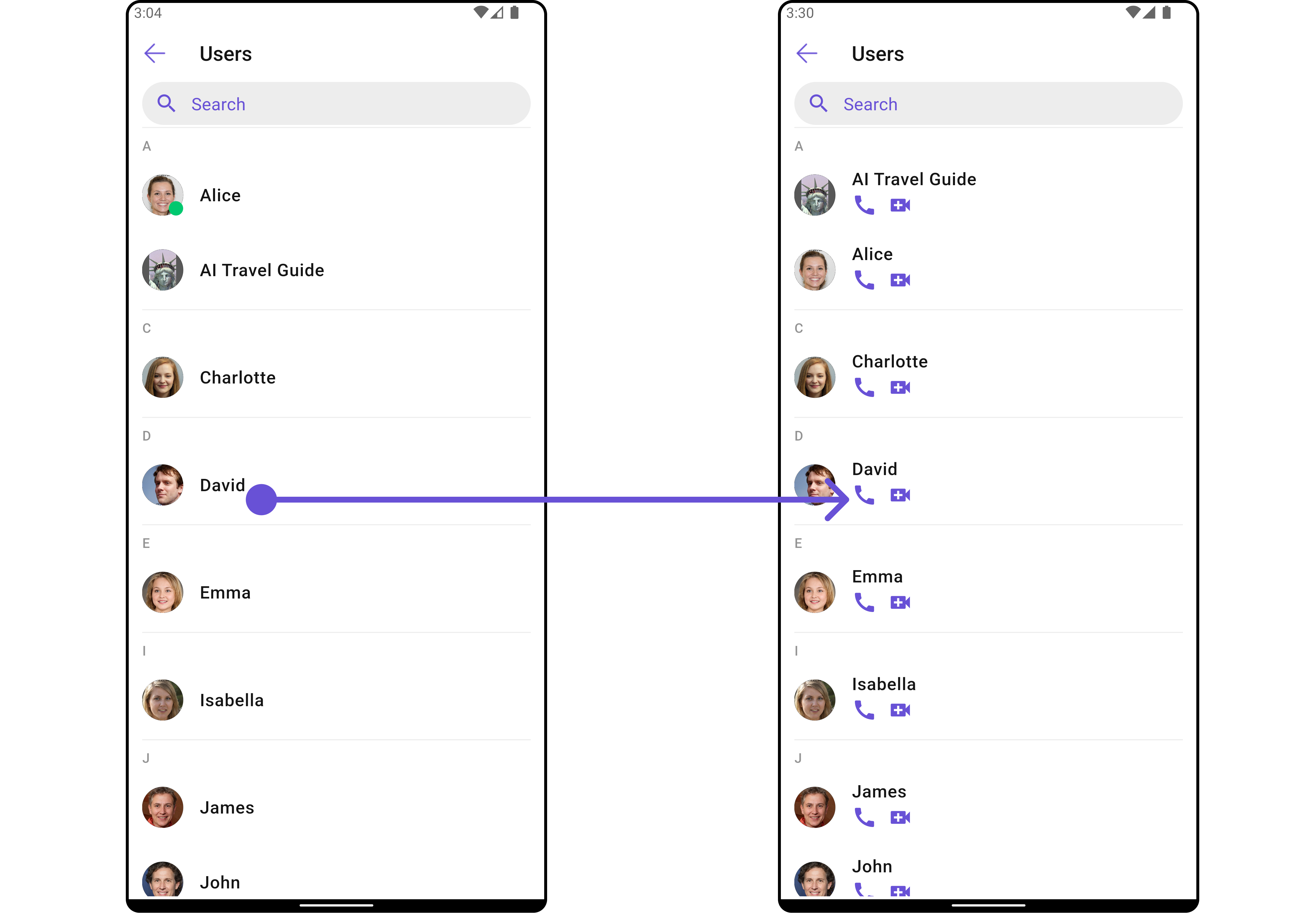
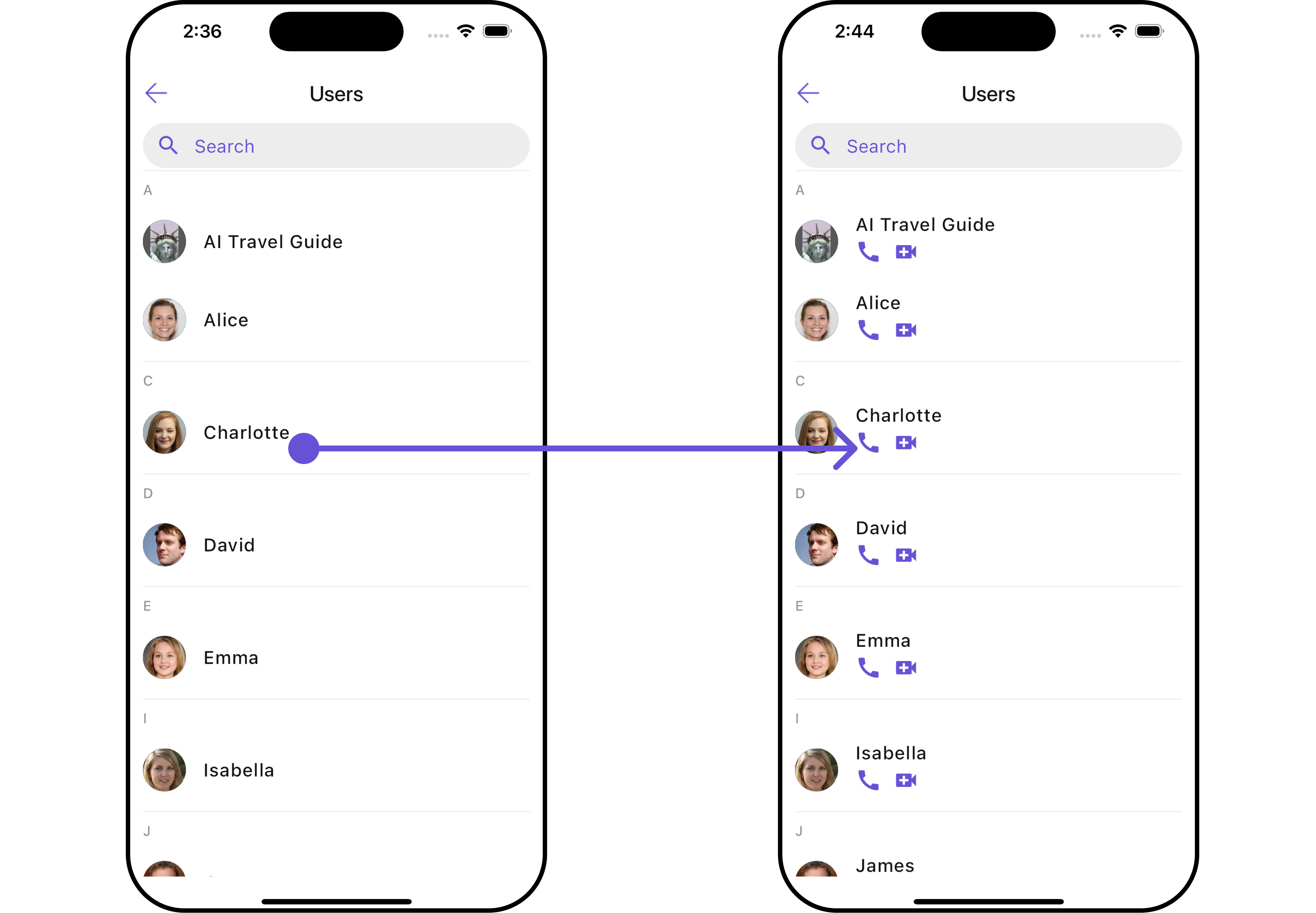
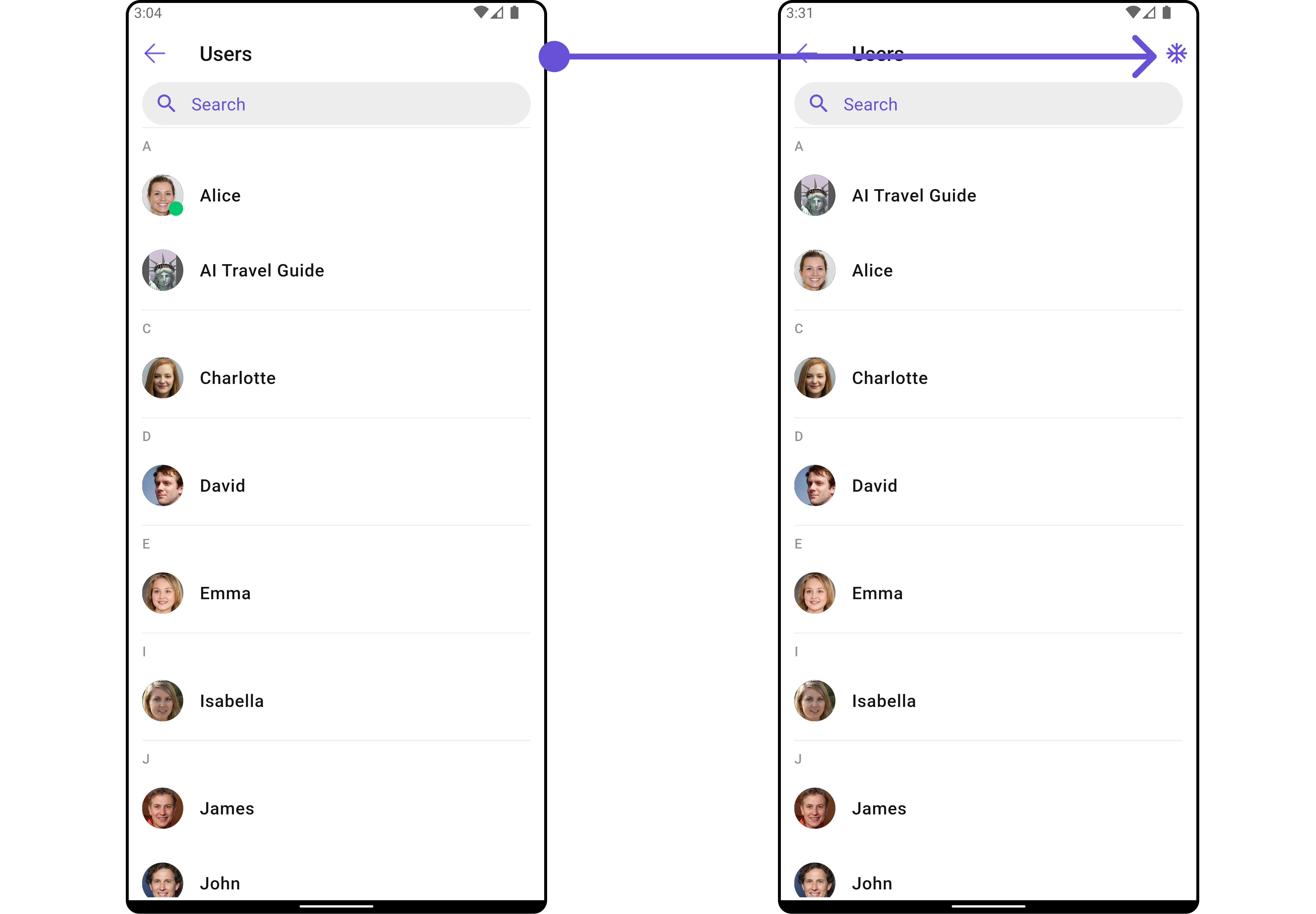
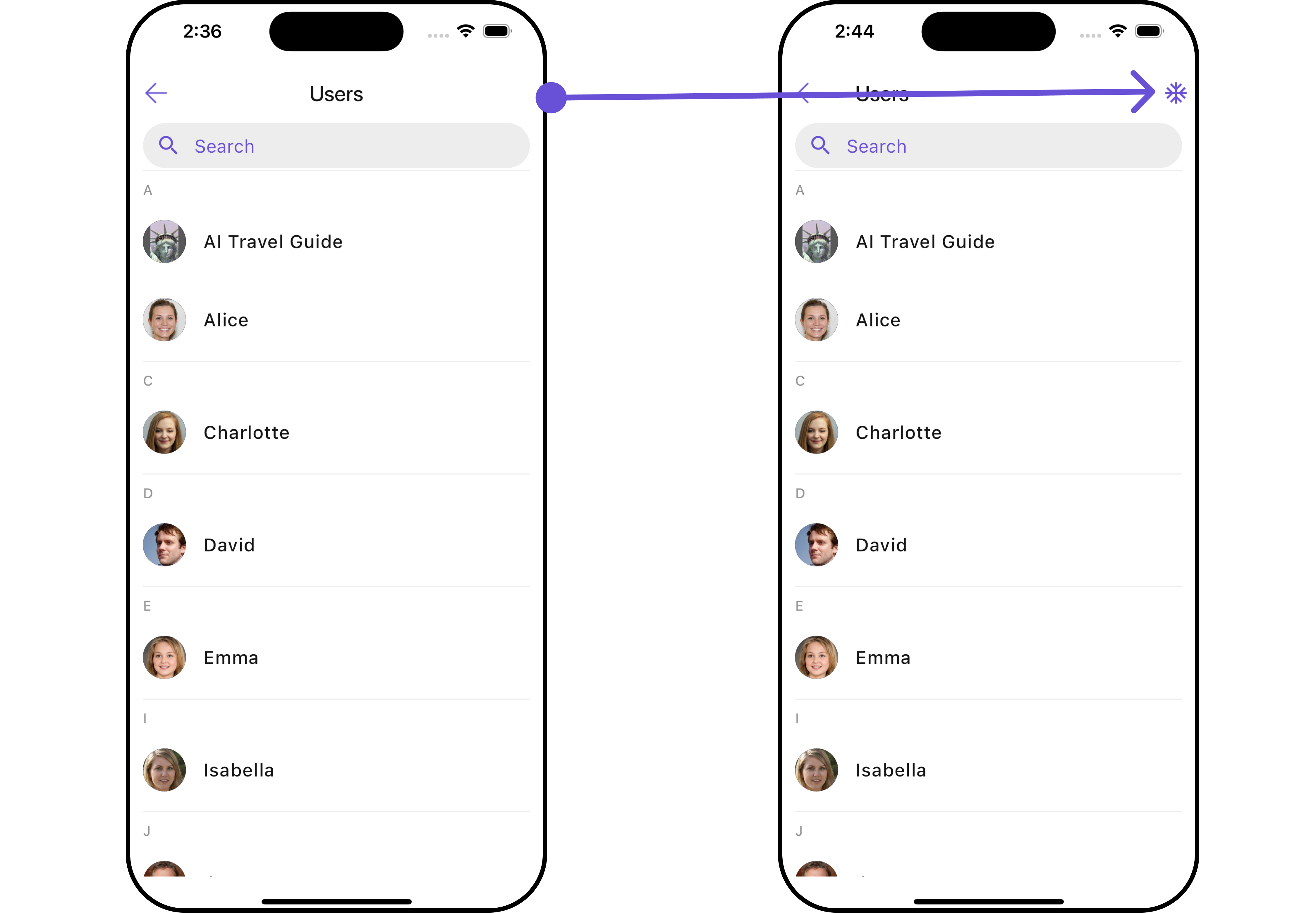
TheCometChatUsers is a Widget, showcasing an accessible list of all available users. It provides an integral search functionality, allowing you to locate any specific user swiftly and easily. For each user listed, the widget displays the user’s name by default, in conjunction with their avatar when available. Furthermore, it includes a status indicator, visually informing you whether a user is currently online or offline.
- Android
- iOS
CometChatUsers widget is composed of the following Base Widgets:
Usage
Integration
AsCometChatUsers is a custom widget, it can be launched directly by user actions such as button clicks or other interactions. It’s also possible to integrate it into a tab widget. CometChatUsers offers several parameters and methods for UI customization.
You can launch CometChatUsers directly using Navigator.push, or you can define it as a widget within the build method of your State class.
1. Using Navigator to Launch CometChatUsers
- Dart
2. Embedding CometChatUsers as a Widget in the build Method
- Dart
Actions
Actions dictate how a widget functions. They are divided into two types: Predefined and User-defined. You can override either type, allowing you to tailor the behavior of the widget to fit your specific needs.1. onSelection
When theonSelection event is triggered, it furnishes the list of selected users. This event can be invoked by any button or action within the interface. You have the flexibility to implement custom actions or behaviors based on the selected users.
This action does not come with any predefined behavior. However, you have the flexibility to override this event and tailor it to suit your needs using the following code snippet.
- Dart
2. onItemTap
TheonItemTap method is used to override the onClick behavior in CometChatUsers. This action does not come with any predefined behavior. However, you have the flexibility to override this event and tailor it to suit your needs using the following code snippet.
- Dart
3. onBack
This method allows users to override the onBack Pressed behavior inCometChatUsers by utilizing the onBack , providing customization options for handling the back action.
By default, this action has a predefined behavior: it simply dismisses the current widget. However, the flexibility of CometChat UI Kit allows you to override this standard behavior according to your application’s specific requirements. You can define a custom action that will be performed instead when the back button is pressed.
- Dart
4. onError
This methodonError, allows users to override error handling within CometChatUsers, providing greater control over error responses and actions.
- Dart
5. onItemLongPress
This methodonItemLongPress, empowers users to customize long-click actions within CometChatUsers, offering enhanced functionality and interaction possibilities.
- Dart
Filters
Filters allow you to customize the data displayed in a list within a Widget. You can filter the list based on your specific criteria, allowing for a more customized. Filters can be applied using RequestBuilders of Chat SDK.1. UsersRequestBuilder
The UsersRequestBuilder enables you to filter and customize the user list based on available parameters in UsersRequestBuilder. This feature allows you to create more specific and targeted queries when fetching users. The following are the parameters available in UsersRequestBuilder- Dart
Events
Events are emitted by aCometChatUsers Widget. By using event you can extend existing functionality. Being global events, they can be applied in Multiple Locations and are capable of being Added or Removed.
To handle events supported by Users you have to add corresponding listeners by using CometChatUserEvents
| Events | Description |
|---|---|
| ccUserBlocked | This will get triggered when the logged in user blocks another user |
| ccUserUnblocked | This will get triggered when the logged in user unblocks another user |
- Dart
Customization
To fit your app’s design requirements, you can customize the appearance of theCometChatUsers widget. We provide exposed methods that allow you to modify the experience and behavior according to your specific needs.
Style
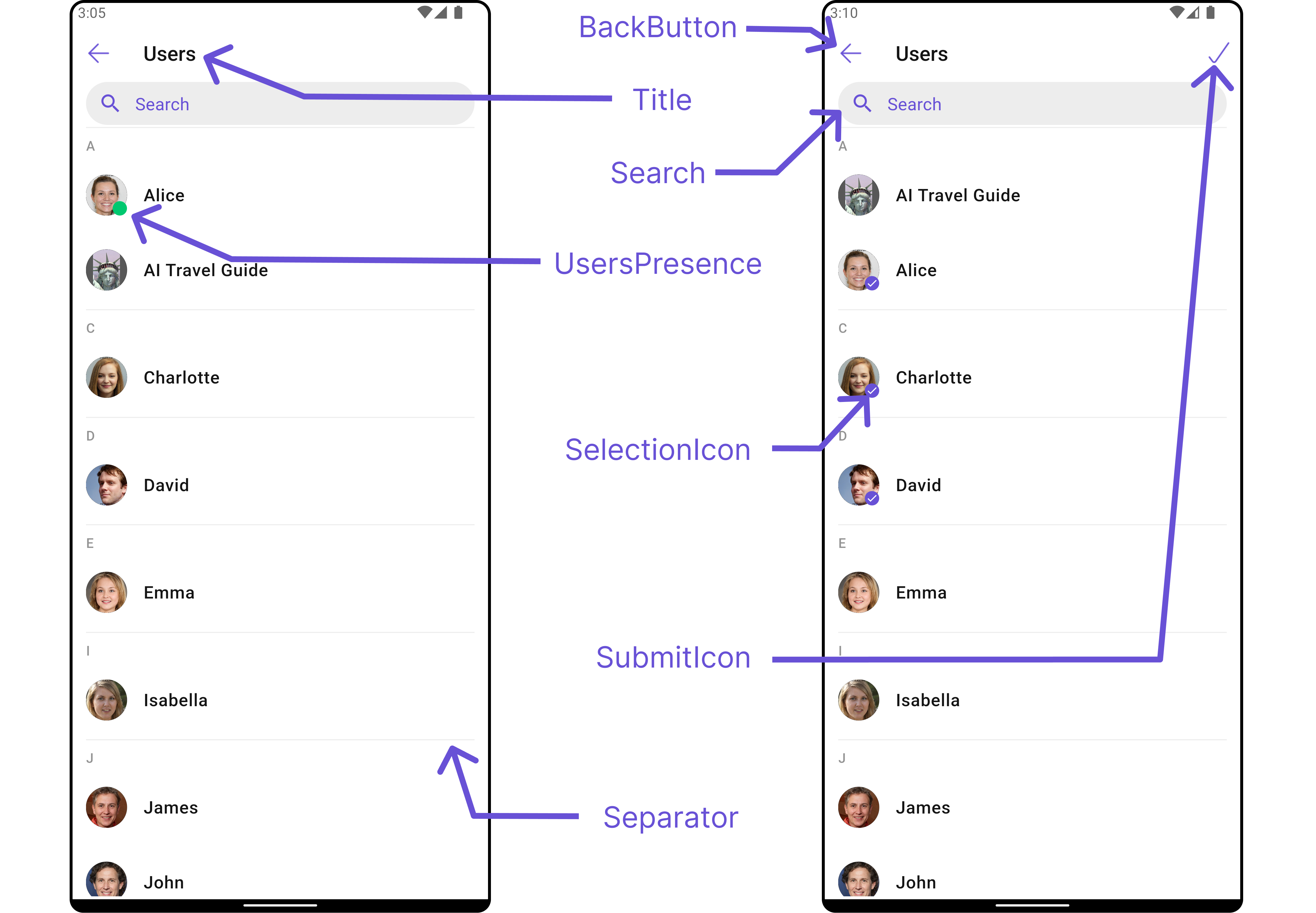
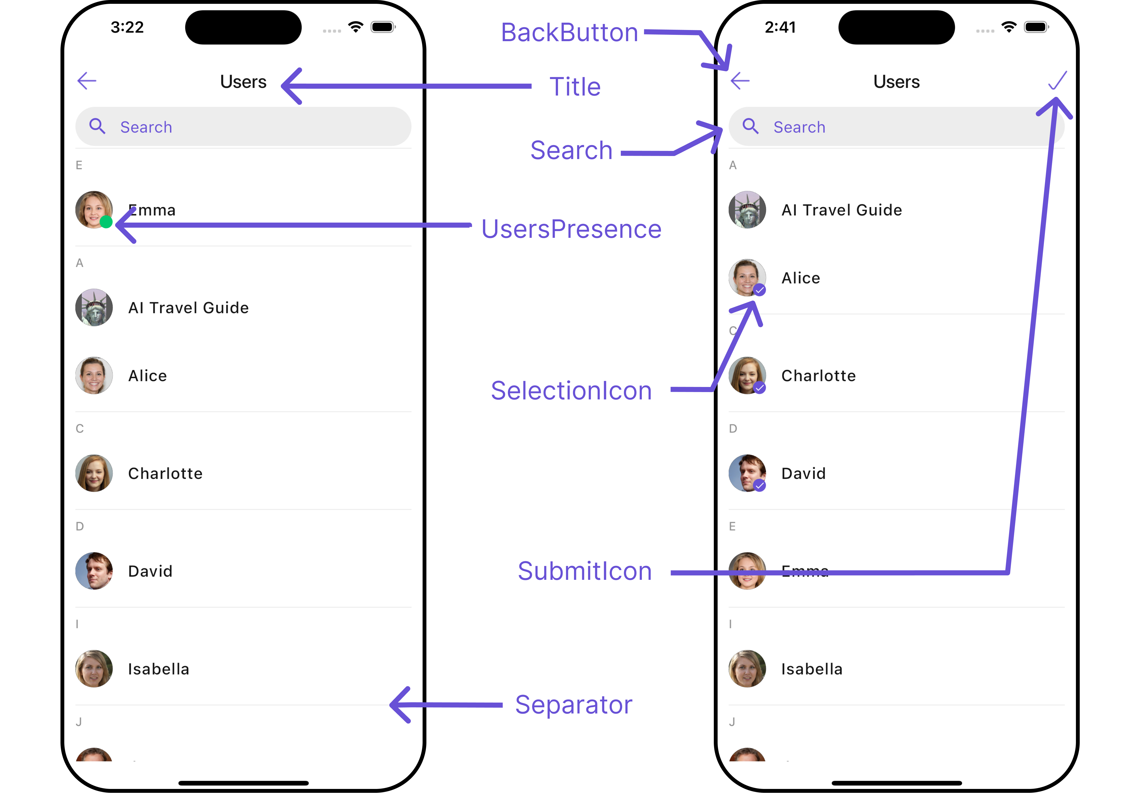
Using Style you can customize the look and feel of the widget in your app, These parameters typically control elements such as the color, size, shape, and fonts used within the widget.1. Users Style
You can set theUsersStyle to the CometChatUsers widget to customize the styling.
- Dart
- Android
- iOS
| Property | Data Type | Description |
|---|---|---|
titleStyle | TextStyle? | Text style for the title within the CometChatUsers widget. |
backIconTint | Color? | Tint color for the back icon. |
searchBorderColor | Color? | Border color for the search input box. |
searchBackground | Color? | Background color for the search input box. |
searchBorderRadius | BorderRadius? | Border radius for the search input box. |
searchIconTint | Color? | Tint color for the search icon. |
searchBorderWidth | double? | Border width for the search input box. |
searchPlaceholderStyle | TextStyle? | Text style for the placeholder text in the search input box. |
searchTextStyle | TextStyle? | Text style for the search input text. |
loadingIconTint | Color? | Tint color for the loading icon. |
emptyTextStyle | TextStyle? | Text style for the empty state text. |
errorTextStyle | TextStyle? | Text style for the error state text. |
sectionHeaderTextStyle | TextStyle? | Text style for the section headers. |
onlineStatusColor | Color? | Color indicating the online status of users. |
separatorColor | Color? | Color of the separators between list items. |
selectionIconTint | Color? | Tint color for the selection icon. |
submitIconTint | Color? | Tint color for the submit icon. |
width | double? | Width of the CometChatUsers widget. |
height | double? | Height of the CometChatUsers widget. |
background | Color? or Gradient? | Background color or gradient of the CometChatUsers widget. |
border | Border? | Border of the CometChatUsers widget. |
borderRadius | BorderRadius? | Border radius of the CometChatUsers widget. |
gradient | Gradient? | Gradient background of the CometChatUsers widget. |
2. Avatar Style
To apply customized styles to theAvatar widget in the CometChatUsers widget, you can use the following code snippet. For further insights on Avatar Styles refer
- Dart
3. StatusIndicator Style
To apply customized styles to the Status Indicator widget in theCometChatUsers widget, You can use the following code snippet. For further insights on Status Indicator Styles refer
- Dart
Functionality
These are a set of small functional customizations that allow you to fine-tune the overall experience of the widget. With these, you can change text, set custom icons, and toggle the visibility of UI elements.- Android
- iOS
- Dart
- Android
- iOS
CometChatUsers
| Property | Data Type | Description |
|---|---|---|
hideSeparator | bool | Flag indicating whether to hide separators between list items. |
theme | Theme? | Theme object for customizing the appearance of the widget. |
searchPlaceholder | String? | Placeholder text for the search input box. |
backButton | Widget? | Widget for the back button in the app bar. |
showBackButton | bool | Flag indicating whether to show the back button in the app bar. |
searchBoxIcon | Widget? | Widget for the search box icon. |
hideSearch | bool | Flag indicating whether to hide the search input box. |
title | String? | Title of the widget or widget. |
errorStateText | String? | Text to display in the error state view. |
emptyStateText | String? | Text to display in the empty state view. |
hideError | bool | Flag indicating whether to hide the error state view. |
hideSectionSeparator | bool | Flag indicating whether to hide separators between sections in the list. |
disableUsersPresence | bool | Flag indicating whether to disable users’ presence status indicators. |
selectionIcon | Widget? | Widget for displaying the selection icon in the app bar. |
submitIcon | Widget? | Widget for displaying the submit icon in the app bar. |
hideAppbar | bool | Flag indicating whether to hide the app bar. |
Advance
For advanced-level customization, you can set custom views to the widget. This lets you tailor each aspect of the widget to fit your exact needs and application aesthetics. You can create and define your own widget and then incorporate those into the widget.ListItemView
With this function, you can assign a custom ListItem to theCometChatUsers Widget.
- Dart
- Android
- iOS
- Dart
custom_list_item.dart
- Dart
main.dart
SubtitleView
You can customize the subtitle view for each item to meet your specific preferences and needs.- Dart
- Android
- iOS
AppBarOptions
You can set the Custom AppBarOptions to the Conversations widget.- Dart
- Android
- iOS
EmptyStateView
You can set a customEmptyStateView using setEmptyStateView to match the empty view of your app.
- Dart
- Android
- iOS
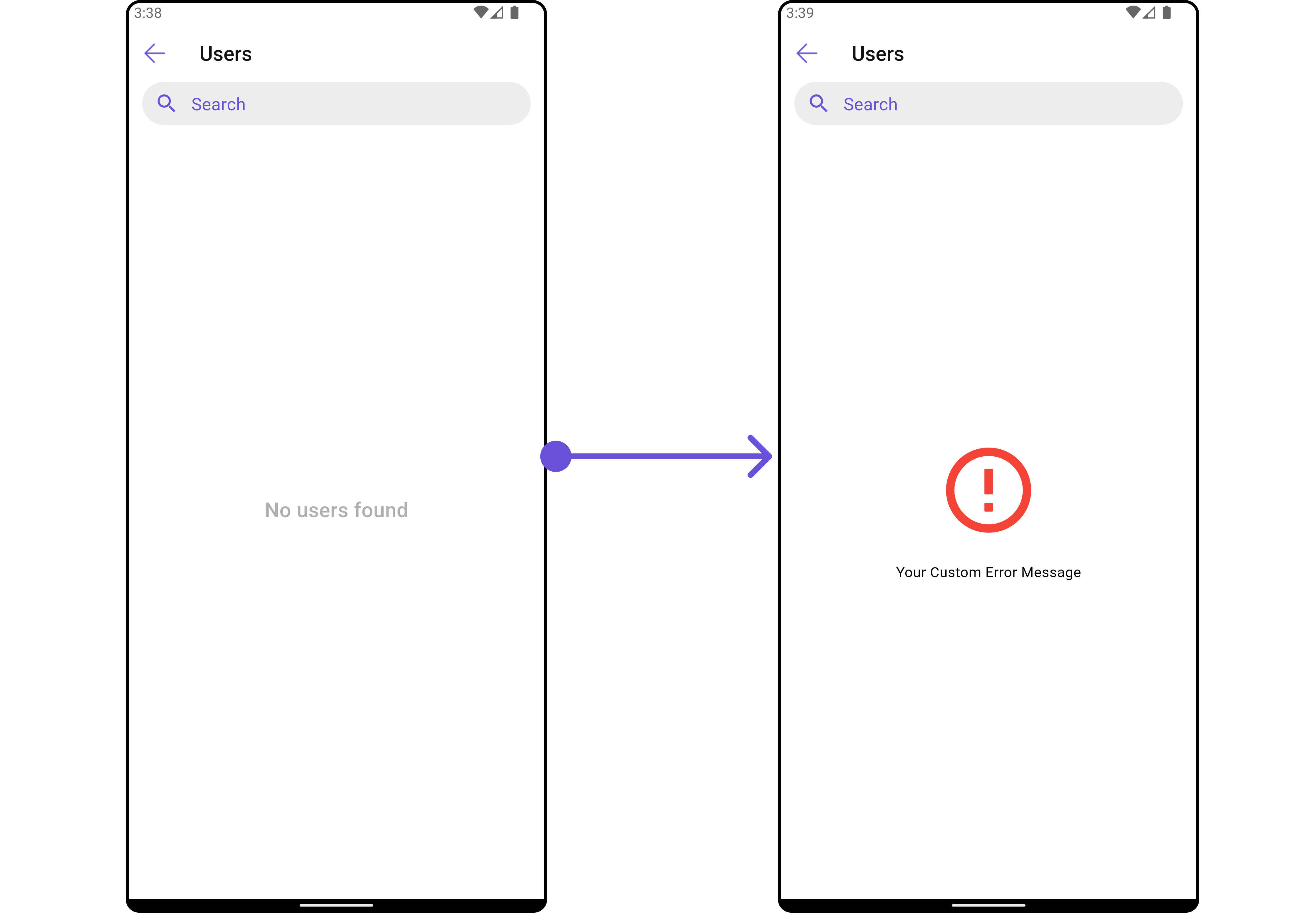
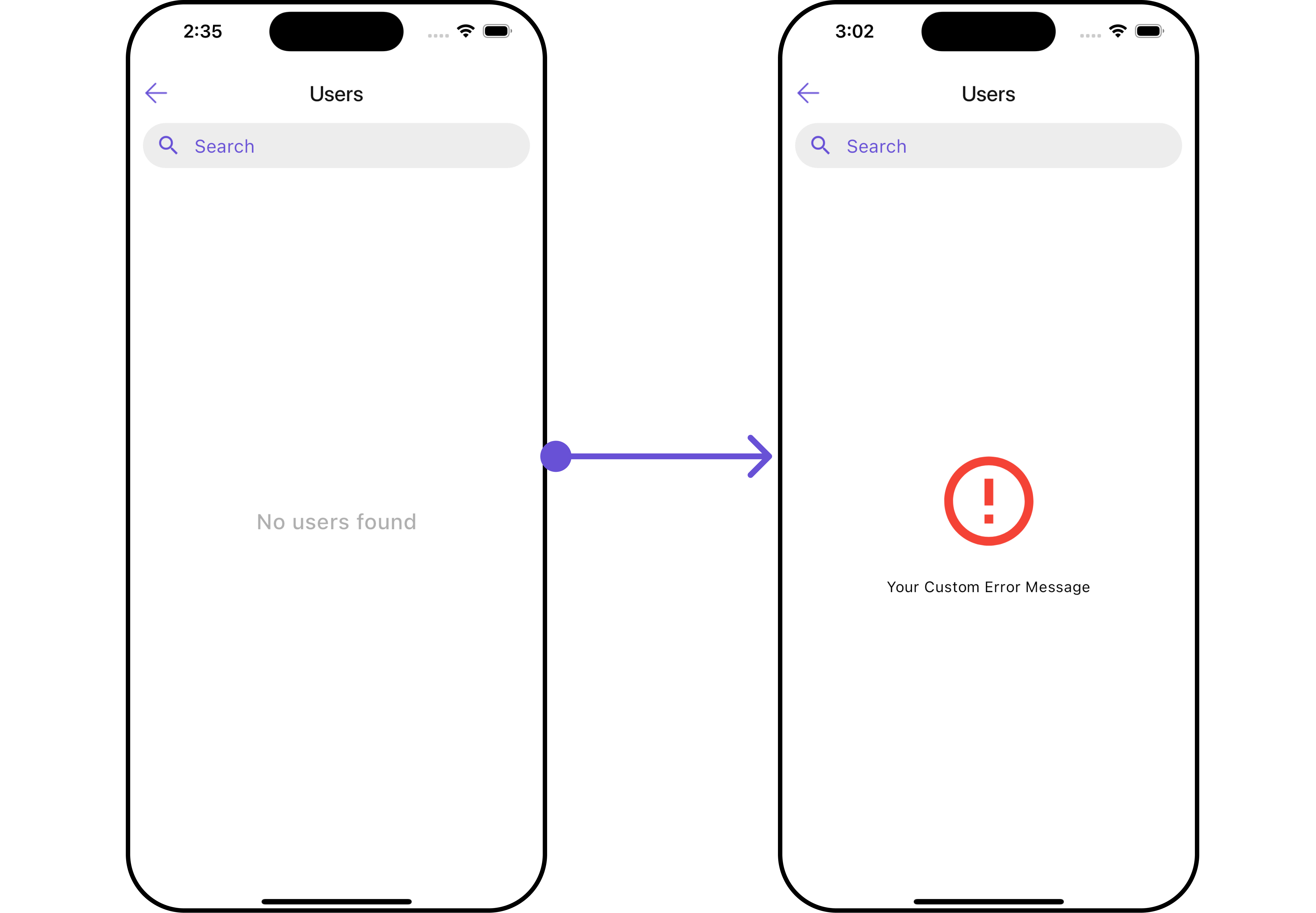
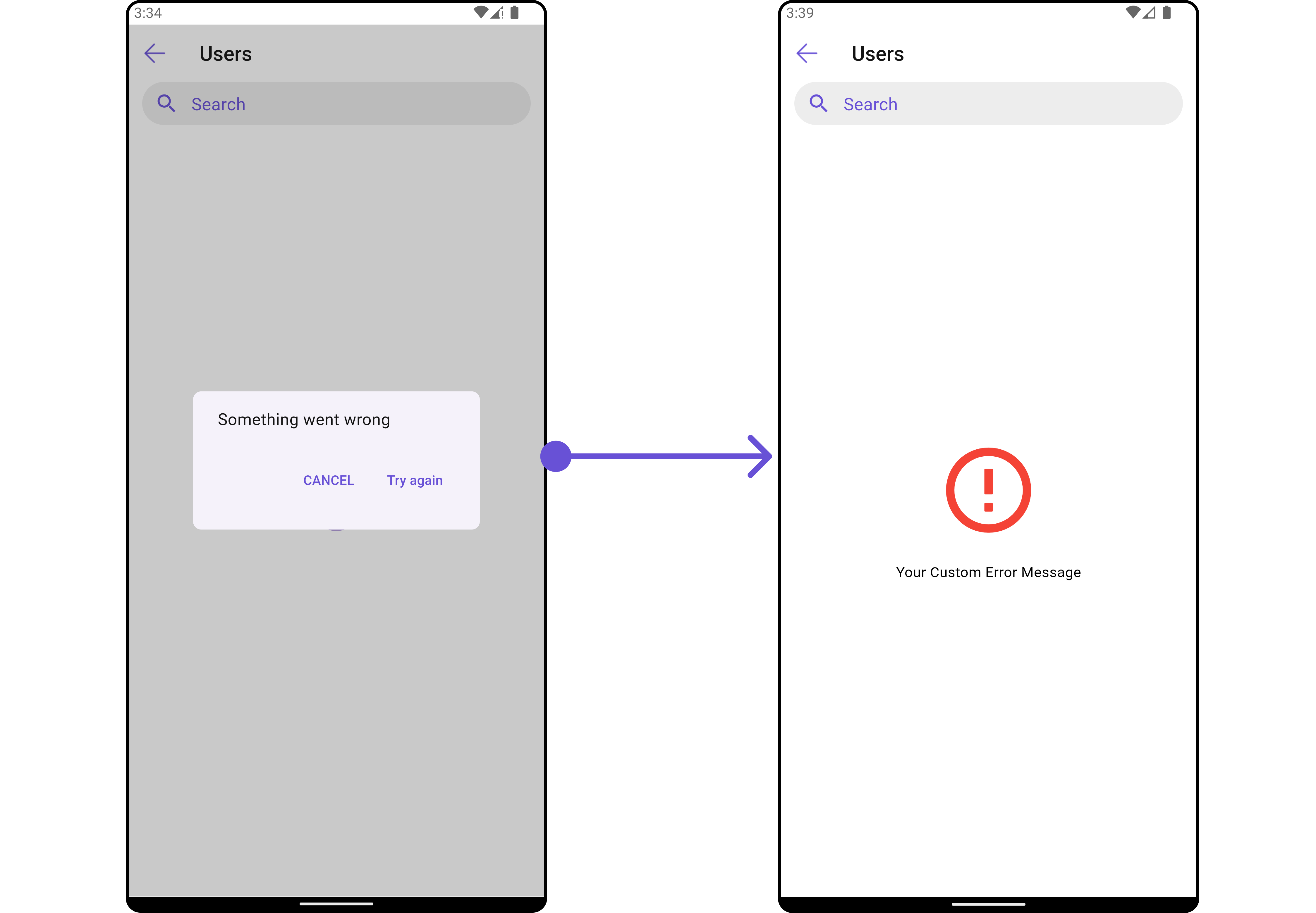
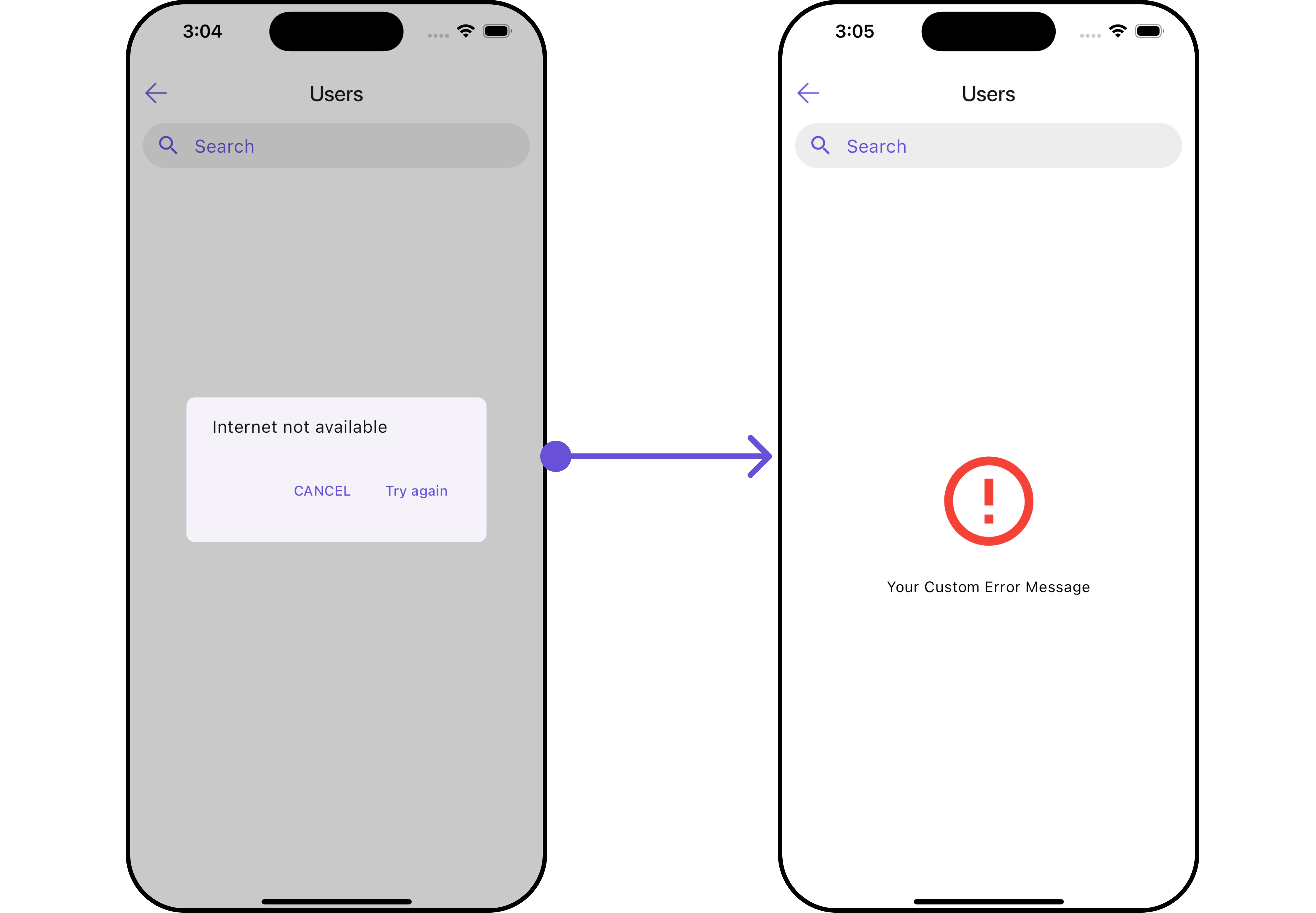
ErrorStateView
You can set a customErrorStateView using setErrorStateView to match the error view of your app.
- Dart
- Android
- iOS
LoadingStateView
You can set a custom loader widget usingloadingStateView to match the loading UI of your app.
- Dart
widget
- Dart
main.dart
- Android
- iOS